 Tweet
Tweet
Hello,
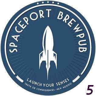
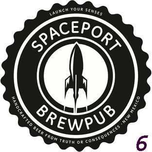
I would like you, the professional brewing community, to provide insight and opinion on some possible logos for a brewpub that I am establishing in Truth or Consequences, New Mexico. The brewpub is located in the same town as the future home of Virgin Galactic and the Spaceport America Visitor's Center. Thus, the name and theme will reflect the early days of dreaming of spaceflight; with the branding and atmosphere a 1940's/1950's retro look and feel.
I have just secured financing and will close on the building at the end of the month; I expect the build out to take 5-6 months with a target opening of November or December.
A graphic artist in Germany has created 14 logos; I have narrowed them down to the following six. Please take a moment to reflect on them and vote for your favorite; and make comments on any or all of them.
All images are copyright 2010 by Velocity Tree LLC and may not be used without permission (please PM me for details).
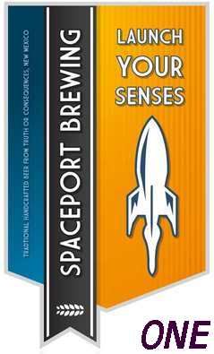
Logo One:
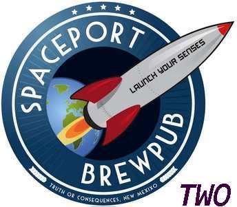
Logo Two:
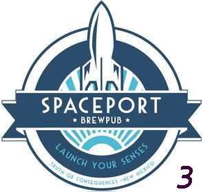
Logo Three:
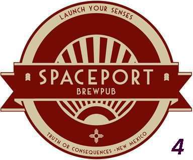
Logo Four:
Logo Five:
Logo Six:
Many, Many Thanks in advance for your opinion and input!
John
I would like you, the professional brewing community, to provide insight and opinion on some possible logos for a brewpub that I am establishing in Truth or Consequences, New Mexico. The brewpub is located in the same town as the future home of Virgin Galactic and the Spaceport America Visitor's Center. Thus, the name and theme will reflect the early days of dreaming of spaceflight; with the branding and atmosphere a 1940's/1950's retro look and feel.
I have just secured financing and will close on the building at the end of the month; I expect the build out to take 5-6 months with a target opening of November or December.
A graphic artist in Germany has created 14 logos; I have narrowed them down to the following six. Please take a moment to reflect on them and vote for your favorite; and make comments on any or all of them.
All images are copyright 2010 by Velocity Tree LLC and may not be used without permission (please PM me for details).
Logo One:
Logo Two:
Logo Three:
Logo Four:
Logo Five:
Logo Six:
Many, Many Thanks in advance for your opinion and input!
John

Comment